"How to create the best in app support"
The brief: To reduce customer call centre calls through uplifting in app support.
The set up: Working on this initiative simultaneously with various other initiatives with multiple cross functional squads.
The process: Research, synthesis, design and iteration.
Key tools: Figma, Askable, Teams, JIRA.
Key methods:
● Current state analysis (tree node diagram).
● Competitor and comparator analysis.
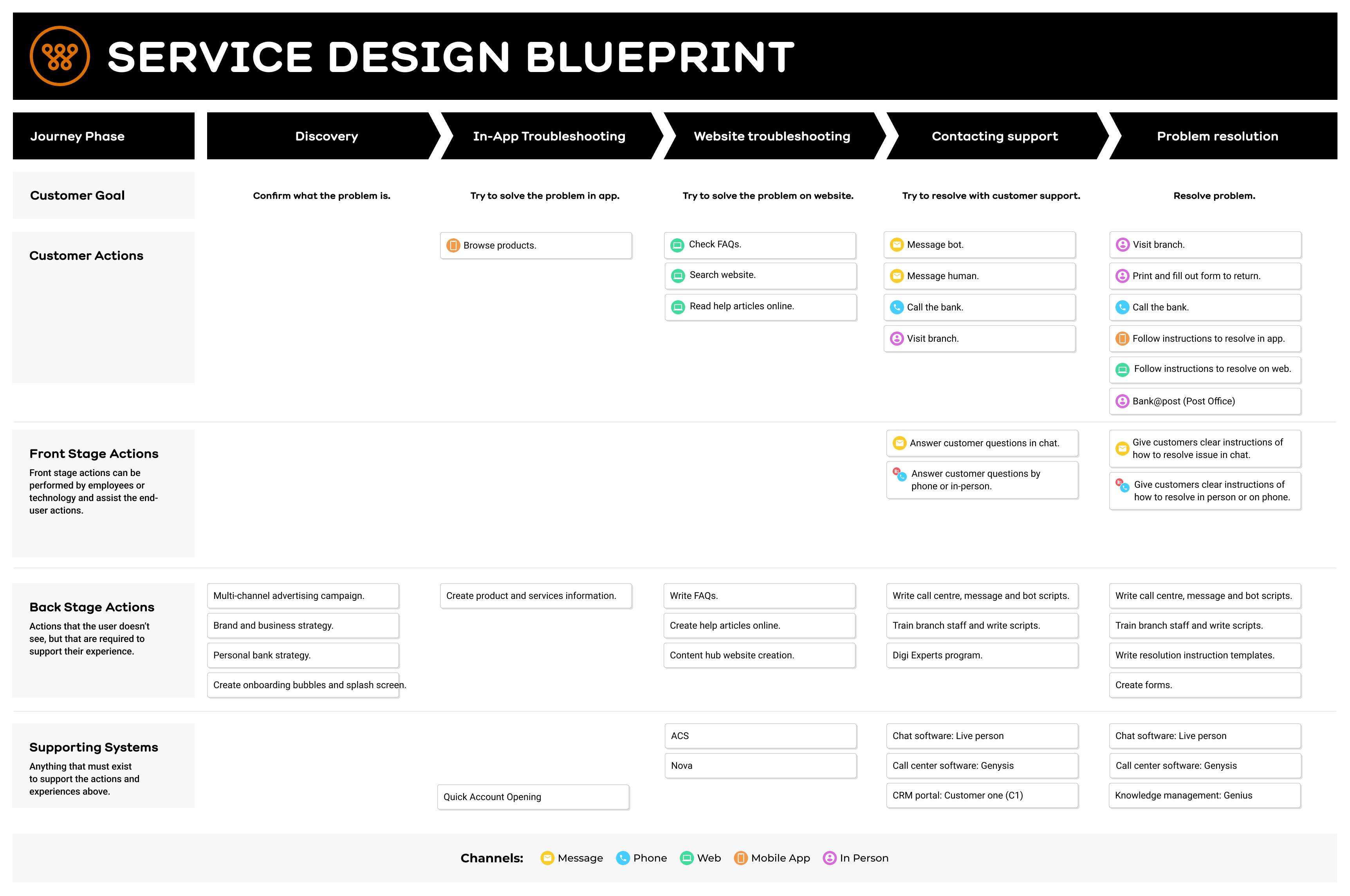
● Service Design Blueprint.
● User interviews.
● Analytics analysis.
● Cross team collaboration.
● UI Design, wireframing and prototyping.
My role: Owned UX Research, synthesis and design. Engaged and collaborated with multiple squads across the bank with intersecting work. Our squad was busy building/delivering a previous initiative I designed so I worked mostly autonomously.
The problem: The call centre receives 25 000 calls per month but Bankwest only has he resources to take 18 000 calls per month, resulting in a 50% abandon rate on these calls, low net promoter score (NPS), colleague burn out and frustrated customers. Customers cannot self serve and get the help they need in app to resolve their issues, without having to call the bank.
The solution: We designed solutions to make it easier for customers to self serve and find the help they need in app for their most pressing issues, without needing to call the bank. We did this by digitising the dispute transaction process, providing a dedicated help page and prioritising the message us feature.
We compared a range of in app support experiences.
Extensive competitive and comparator analysis helped us gain insights into how other apps handle in-app support. We identified some clear opportunities for improvement, regarding our chat feature, FAQs and the overall information architecture (IA) of help.
Current state analysis.
A detailed tree node diagram of the current state of the bank’s in app support helped us to analyse the experience at a closer level. Some clear pain points were already evident and some some key opportunities to further explore were:
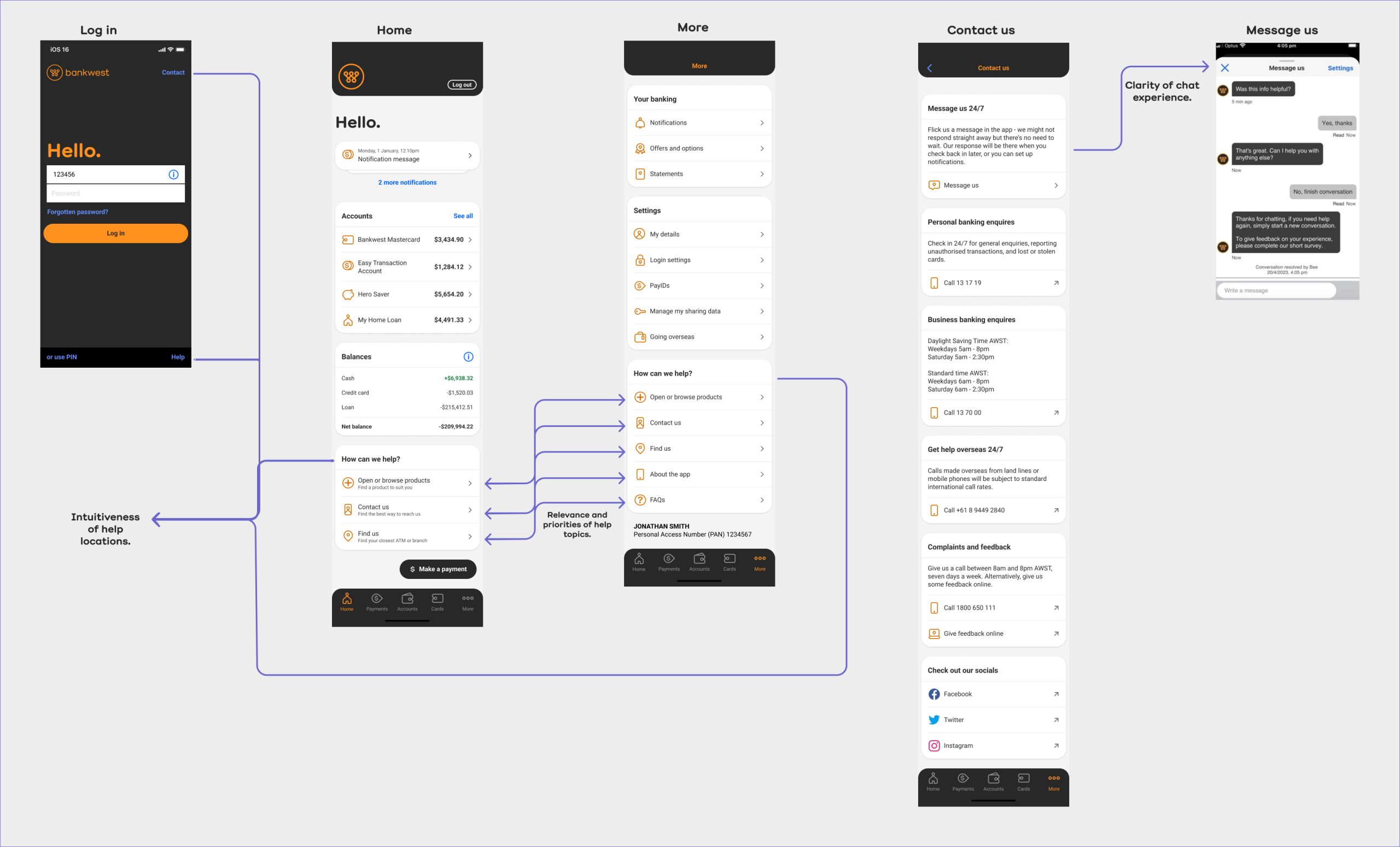
● Whether the help locations were intuitive for users to find?
● How relevant and of how high priority help topics were to users?
● Whether the chat experience made the most sense to users and was it meeting their expectations?

We consulted with our app users.
We did 10 target user interviews, covering 5 tasks, with bankwest app customers in order to learn:
● Which help topics customers find helpful or not helpful and of highest to lowest priority and why.
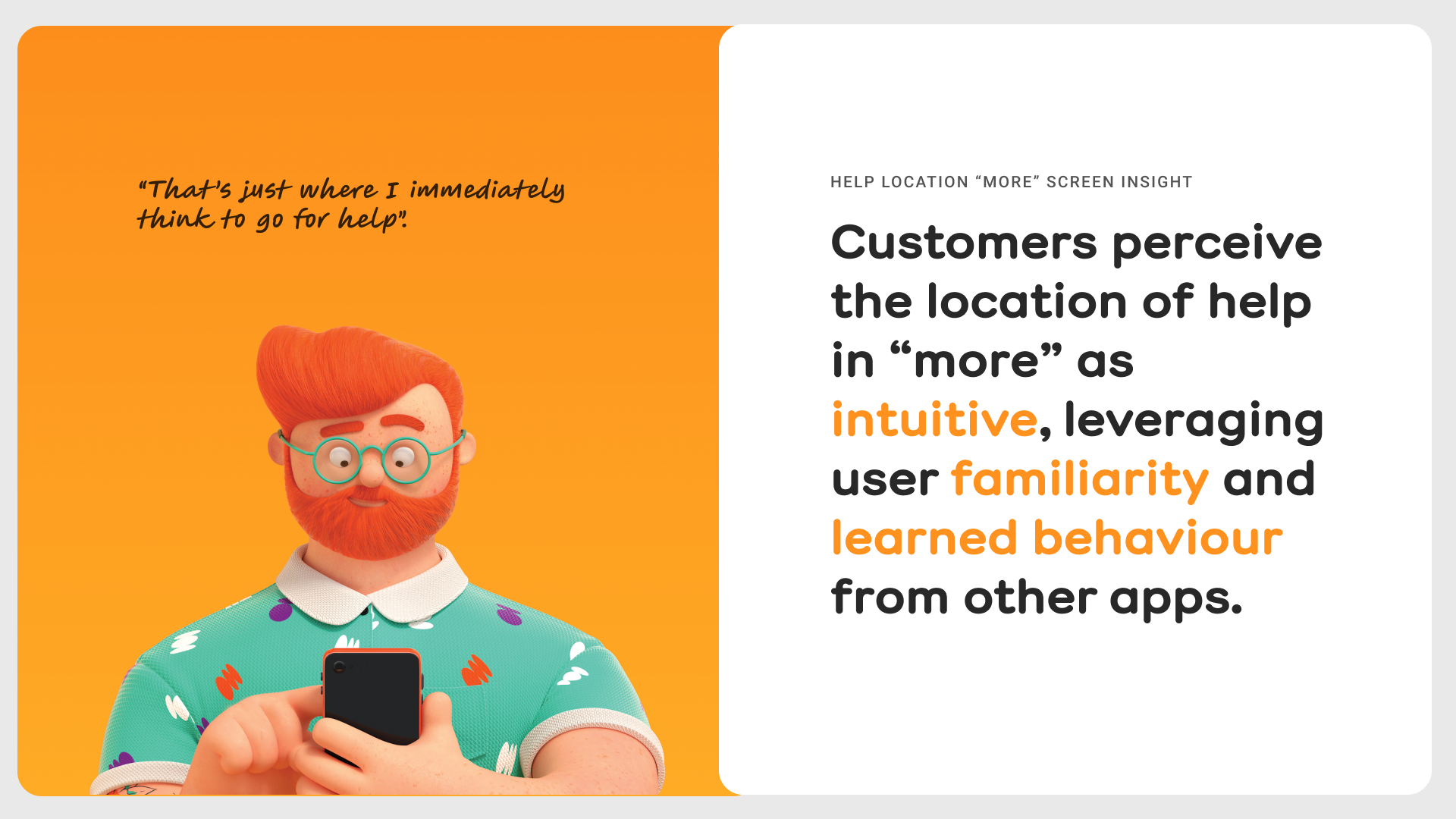
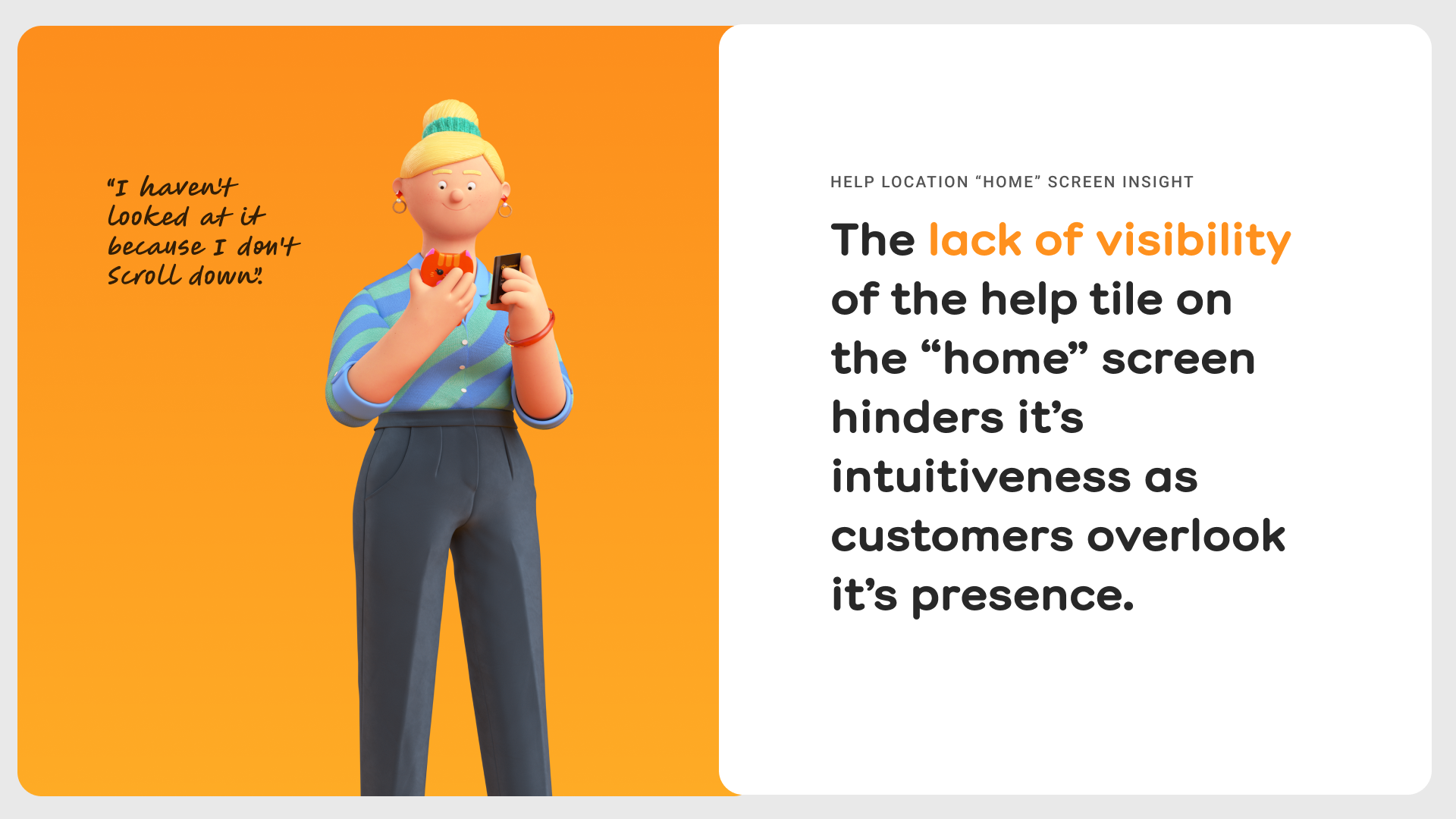
● Customer pain points of finding help in app and expectations of where help would be the most intuitive and easy to find and why.
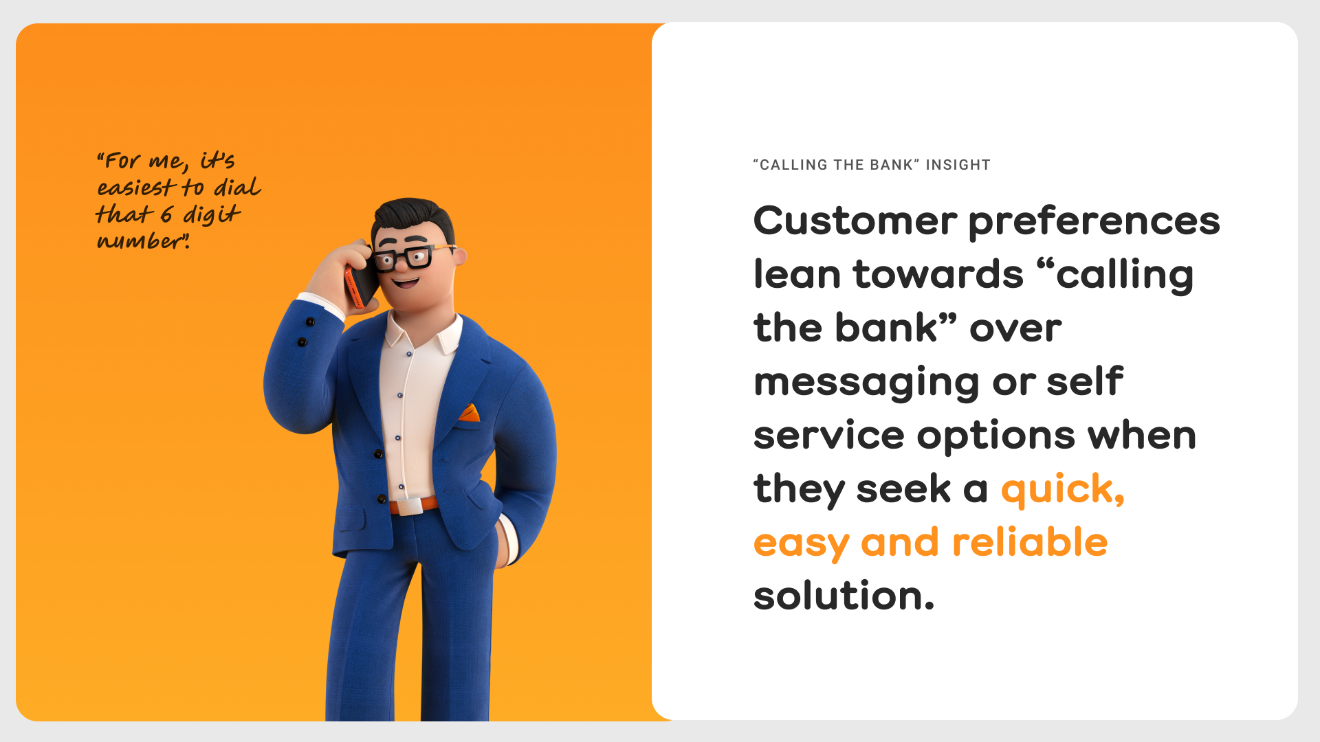
● Why users call us rather than message us, how long they try to resolve issues before calling us, what’s been their processes to solve issues and how have their experiences been.
● Customer pain points, experiences and preferences with messaging the bank and what their expectations are of this experience.

There were some clear themes that emerged.
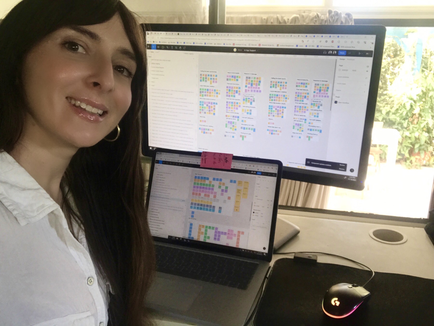
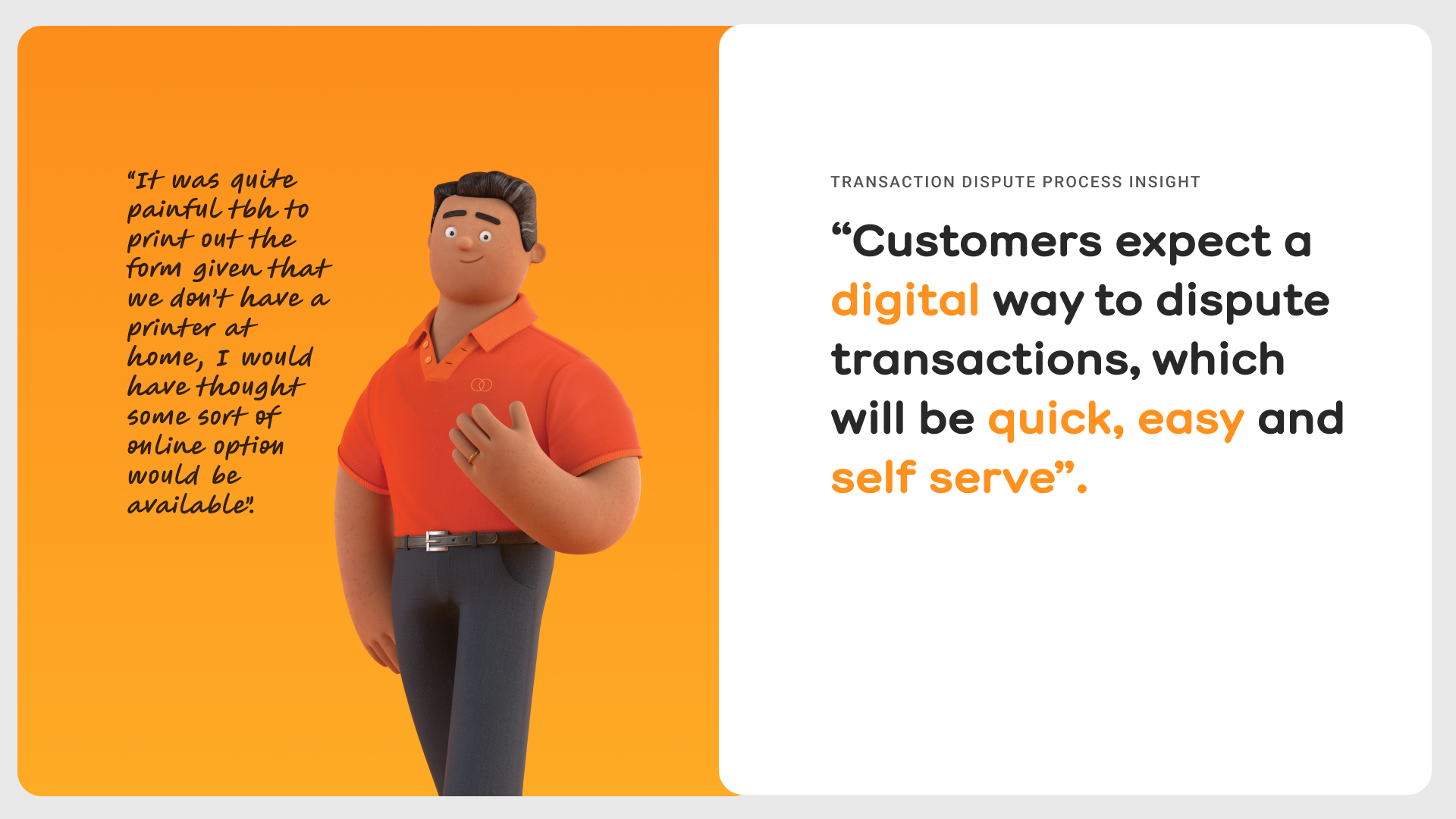
Digital affinity mapping enabled us to synthesise the feedback from the interviews and all that we’ve learnt from the UX research thus far. Some clear themes emerged in this process about users’ expectations and pain points regarding the bank’s in app support experience.
These were our findings and insights.







Understanding gaps in our processes to enhance efficiency.
Creating a service design blueprint for the customer journey of problem resolution with the bank enabled us to visualise what’s going on in the organisation and understand some of the the implications of potential process changes.
In the problem resolution phase the customer may have to visit a branch, use bank@post at a post office and/or print and fill out a physical form, which are all ‘in person’ customer actions, which we want to minimise to help our customers self serve digitally as much as possible and to strive to be digital disrupters in the industry.
Quantitative data re-enforced our qualitative data insights.
There were multiple data sources from 400+ customers (margin of error 4.7%) that we drew from including:
● Surveys and adobe analytics.
● Reviews and complaints.
● Call centre and branches.
● Website search and help pages.
● Digital conversations (messaging).

Stakeholder engagement and collaboration was key.
Aside from valuable collaboration with the self service first, website, digital conversations and daisy squads I also reached out to the customer insights manager at the bank to take him through my research thus far to see if he had any relevant insights. The quantitative data he synthesised from a 442+ customer survey aiming to optimise digital engagement validated that completing transaction disputes in-app was highly sort after by our customers.
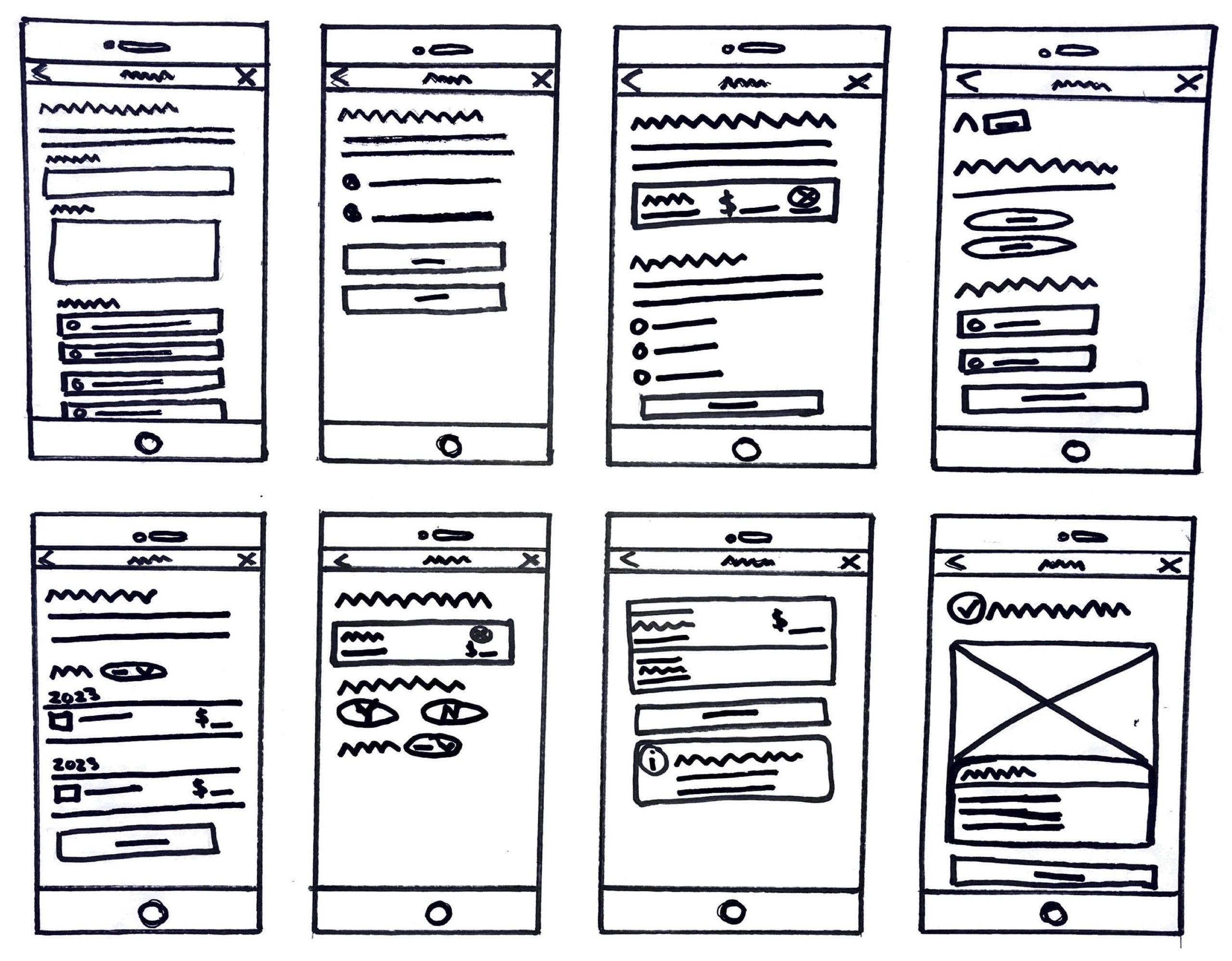
Sketching and wireframing the self serve transaction dispute app flow.
If we had to choose one singular project to deliver we recommended the transaction dispute digital form as it’s the most desired in app feature by customers and where we could make the most impactful UX improvements.
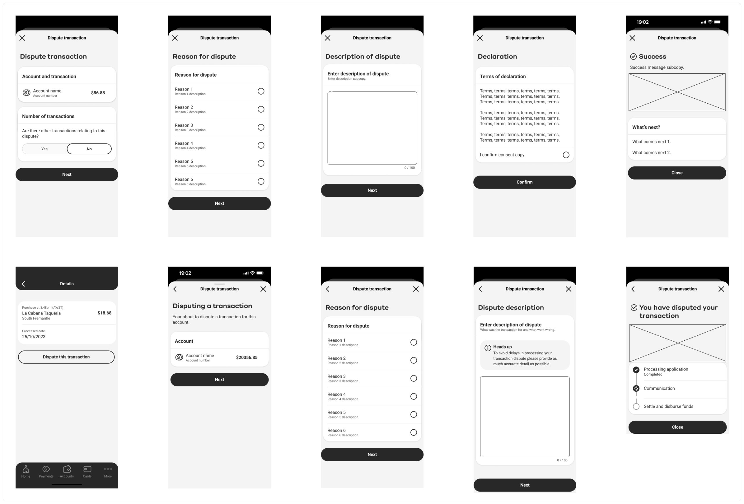
Happy path of the transaction dispute journey.
‘Simple’ and ‘easy’, (Bankwest’s vision), UI Design solutions for our customers to dispute transactions in app were mocked up and we were very confident we had a solid, on brand, base of what we needed to capture in this flow. Further iterations would need to be done to flesh out any unhappy paths, error states and considering all privacy, compliance and technical requirements/limitations.


Empowering users with a in app help hub.
Uplifting the message us feature.
Further recommendations to support customers in app.
● Marketing – educate customers on the messaging service updates to encourage engagement/shift behaviours (Eg. emails EDM, in-app notification, flash screen, call hold message and digital onboarding).
● Service design – quicker chat responses (approval of resources to deliver) and quicker call responses (design solutions to uplift of self-service and chat features).
● Explore UI design solutions and iconography to increase visibility of help in “more” , “login” and “home” screens to ensure easy accessibility to help hub.

Re-route but far from the end...
The bank had a re-structure and our squad was given a different initiative to work on. “Uplifting chat” and “Self serve transaction dispute” initiatives were each given to different squads offshore. However, no squad would be holistically looking at in app support anymore. We had been enthusiastic about continuing to work on in app support solutions. However, we were confident our work would be of value to other squads at the bank and were hopeful to look at in app support as a whole again in the future.


